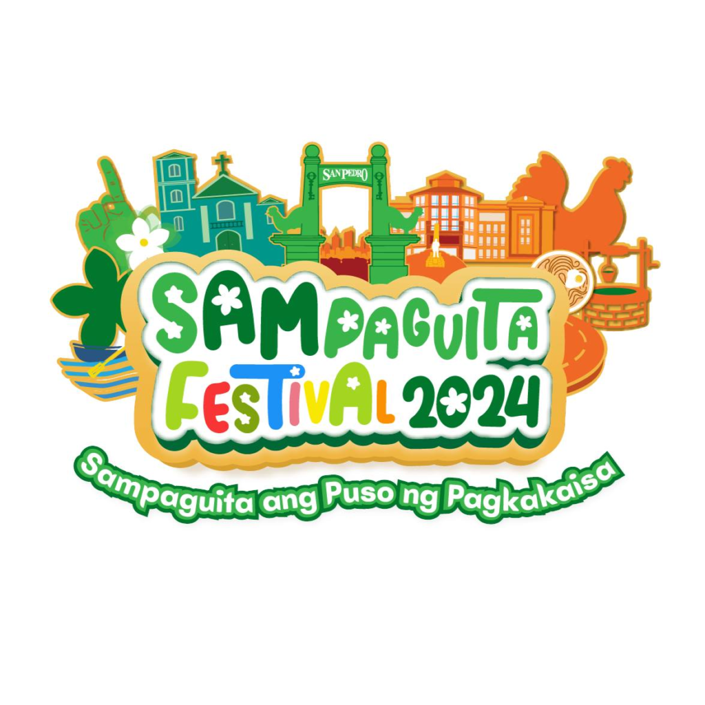
#EasterSunday | The Sampaguita Festival 2024 wordmark logo is a vibrant embodiment of the spirit of unity and the cultural richness of San Pedro.
The logo is central to the festival’s theme “Sampaguita ang Puso ng Pagkakaisa,” prominently showing the Sampaguita flower, a symbol of purity and solidarity. It represents the heart of unity that brings the community together, celebrating their collective identity and harmony.
The dynamic and modern typography reflects the administration’s progress, symbolizing the journey and achievements made thus far. The colorful letters stand for “diversity within unity”, portraying a community that thrives on inclusivity and collective growth. It is also reminiscent of the warmth and joy of summer, capturing the festive mood of the celebration, and encapsulating the diverse yet harmonious aspects of San Pedro’s identity.
The logo is not just a celebration of the Sampaguita but a homage to the people of San Pedro. It honors the lifestyle, culture, tradition, and all that San Pedro has to offer, embodying the essence of the festival as a celebration of life and community spirit.
Lungsod ng San Pedro Una sa Turismo! Una sa Laguna! #SampaguitaFestival2024
